Herman Miller has been exploring colour as a means of transforming the office experience
When it comes to sustainable office design, colour is a powerful tool for creating a workspace that’s productive, inspiring and helps connect people. In the workplace, colour is about so much more than just paint, and it can be introduced in lots of different ways.
“While the presence of colour in your environment can impact the workplace, so does the lack of colour! In fact, working in an office with a neutral chromatic atmosphere, like gray may increase the risk of burnout by 15% and decrease productivity by 12%. Businesses want to find the right balance between maximizing employee productivity and creating a comfortable and inspiring environment. That’s why they come to us.” said Stacy Stewart, Regional Director MEA at MillerKnoll.
Here are some of the ways Herman Miller has been exploring colour as a means of transforming the office experience.
The Technicolour Office
Vibrant, dynamic workplaces that use colour purposefully can help people do their best at work. Knowing this, Herman Miller realised what a powerful tool colour could be. As well as injecting personality into any workspace, colour psychology, and Herman Miller’s own research, suggests that colour is capable of influencing people’s mood, experience, and productivity. These observations prompted Herman Miller to transform how colour is used in furniture from head to toe.
Cosm
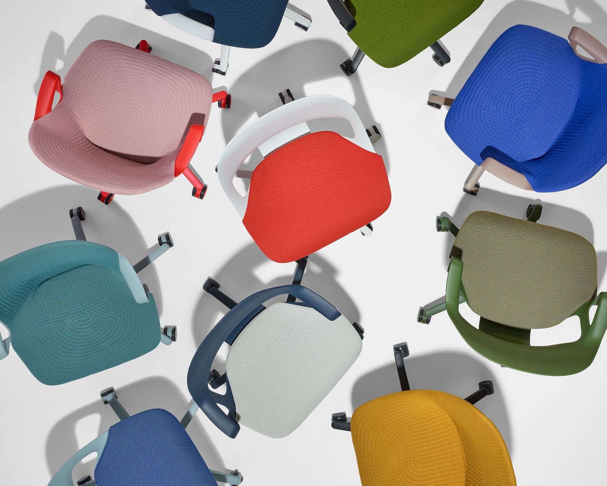
Herman Miller’s adventures in colour began with Cosm. Instantly responding to the body’s movements, this ergonomic chair was the first to experiment with the Dipped in Colour process. Using this technique, Herman Miller could saturate each chair in colour – from the soft materials to the plastic resins and paints. Cosm also opened the door to bold colours such as Canyon, a fiery red. The colour of fire and blood, red is associated with energy, strength, determination, love, passion. Studies also suggest a connection between employee mental productivity and the colour red.
Ratio
Colour has played a key role in the evolution of this sit-to-stand desk. The next generation of the table gives users maximum flexibility, and that applies to how it looks as much as its configurability. Now available in nine colourways that can be mixed and matched in 41 different colour combinations to create a feeling of edgy sophistication; bold, audacious fun; or breezy calm.
Zeph
This streamlined ergonomic desk chair harks back to the optimism of mid-century design via its kinematic one-piece seat and back, and via its use of “crayon-box” colours such as Blaze, a warm, bright red. Zeph comes Dipped in Colour from shell seat to feet for a joyful and harmonious look. It’s also available in colours such as Cocoa and Nightfall, which are associated with power, elegance, and professionalism. Glacier, meanwhile, evokes tranquility, trust, and loyalty.
OE1
Made up of modular, mobile tables, storage systems, shelves and more, the OE1 Workspace Collection gives organisations the freedom to create workspaces that express their needs and their brand. OE1 comes in a range of finishes, including tranquil tints such as Denim and Light Oak. When used in the workplace, these colours evoke a sense of calm, offering the potential to reduces stress. Denim and Light Oak may also promote concentration, increasing productivity, confidence, and stability. At the lively end of the spectrum, OE1’s colourways include a deep, rich shade of Olive, which is associated with harmony, safety, growth, and wisdom.
Byne
With Byne, users get maximum flexibility through one highly configurable workplace system. Organisations can explore their choices and choose from five different legs, a range of finishes and a rainbow of colour combinations across dividers, desk surfaces, leg options and more. When it comes to surface materials, Byne comes in Blush, a fresh, modern colour that creates a sense of calm and relaxation; Whale, which combines the serenity of blue with green’s associations with renewal and energy. Meanwhile Graphite, Core Tungsten and Glacier all foster a sense of diplomacy and intellect.
*********************************************************************
Readers
These are extraordinary times. All of us have to rely on high-impact, trustworthy journalism. And this is especially true of the Indian Diaspora. Members of the Indian community overseas cannot be fed with inaccurate news.
Pravasi Samwad is a venture that has no shareholders. It is the result of an impassioned initiative of a handful of Indian journalists spread around the world. We have taken the small step forward with the pledge to provide news with accuracy, free from political and commercial influence. Our aim is to keep you, our readers, informed about developments at ‘home’ and across the world that affect you.
Please help us to keep our journalism independent and free.
In these difficult times, to run a news website requires finances. While every contribution, big or small, will makes a difference, we request our readers to put us in touch with advertisers worldwide. It will be a great help.
For more information: pravasisamwad00@gmail.com

